ReactJS Popup: Modals, Tooltips, and Menus
1. Third-Party Package: reactjs-popup
NPM contains reactjs-popup, a third-party package to display popups in your application.
It provides a React component that helps you create simple and complex Modals, Tooltips, and Menus for your application.
Installation Command:
1.1 Advantages
- ReactJS provides Modal, Tooltip, and Menu components.
- Provides support for controlled Modals & Tooltips.
2. ReactJS Popup Props
You can provide different props to the ReactJS Popup component. Below are some of the most commonly used props.
| Prop | Description | Default Value |
|---|---|---|
| trigger | Represents the element to be rendered in-place where the Popup is defined. | JSX element |
| modal | When set to true, Popup content will be displayed as a modal on the trigger of Popup. If not, a tooltip will be displayed. | false |
| position | Defines the position of the tooltip. It can be one of ‘top left’, ‘top right’, ‘bottom right’, ‘bottom left’. | bottom center |
| open | Defines the state of the Popup. Whether it is opened or not. | false |
| overlayStyle | Custom overlay style. | object |
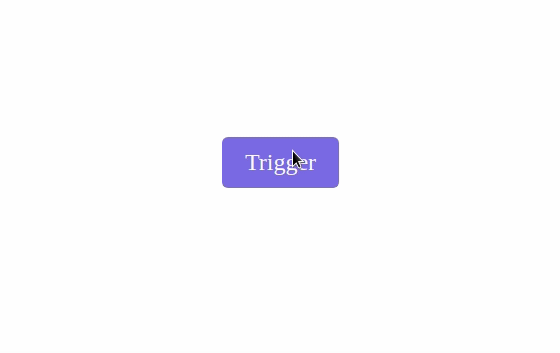
2.1 trigger Prop
File: src/components/ReactPopup/index.js
trigger={
Trigger
} >
<p>React is a popular and widely used programming language</p>
export default ReactPopUp
Collapse
File: src/components/ReactPopup/index.css
Collapse
File: src/App.js
The value of the trigger prop should be a JSX element.
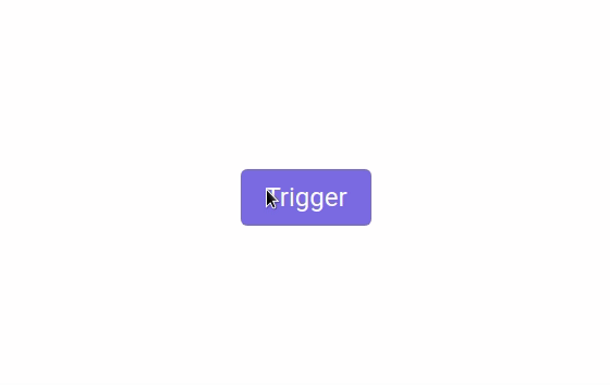
2.2 modal Prop
File: src/components/ReactPopup/index.js
modal trigger={
Trigger
} >
>React is a popular and widely used programming language/p>
Expand
2.3 modal Prop with close button
File: src/components/ReactPopup/index.js
modal trigger={
Trigger
} > {close => (
>React is a popular and widely used programming language/p>
type=“button” className=“trigger-button” onClick={() => close()} > Close
)}
export default ReactPopUp
Collapse
2.4 position Prop
File: src/components/ReactPopup/index.js
trigger={
Trigger
} position=“bottom left” >
>React is a popular and widely used programming language/p>
export default ReactPopUp
Collapse
2.5 overlayStyle Prop
File: src/components/ReactPopup/index.js
modal trigger={
Trigger
Expand